Welcome to the TrackMaster® EquiGraphix handicapping help guide. The following help sections are available for the product:
Races & PPs
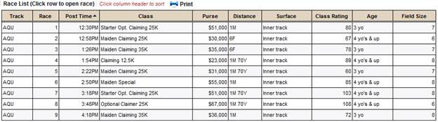
Race List
The Race List contains full past performances and an overview of all the races on today's card with the following columns of data:
- Track - The official track abbreviation where the races are being held
- Race - The number of the race on the card
- Post Time – Scheduled time for race to start in local time
- Class – Class Conditions
- Purse - The amount of money the horses compete for in this race
- Distance – Distance of the race in furlongs,miles or yards
- Surface – Surface Type of the race
- Class Rating - A statistical measure of the difficulty of today's race
- Age – Age Restrictions
- Field Size - Number of horses entered into today's race
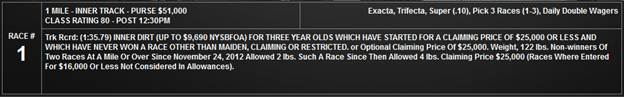
As you move your mouse over each race in the list, over the race number in the sliding race menu at the top of the screen, and also after a race is opened, a race header section will appear with all the following race info: (Race Number, Distance, Surface, Purse, Class Rating, Post Time, Race Wagers, Complete Race Conditions/Description)
PPs
Download your complete past performances with full running lines in pdf format at no extra charge from the Races & PPs page. There are three formats to choose from, the Standard Platinum PPs, the Bias Platinum PPs, and the Pace Platinum PPs. The Bias Platinum PPs have all of the same information as the Standard version, but also have Track Bias information for each running line. The Pace Platinum PPs have all of the information of Bias Platinum PPs, with the exception that the running times of the race leaders in the pps running lines are replaced with a horse’s individual pace figures for that race.

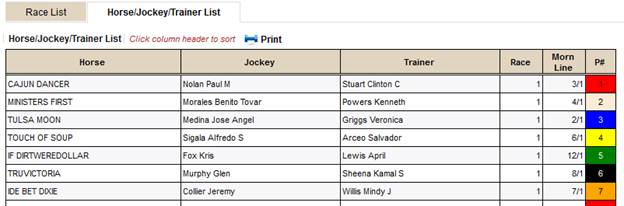
Horse/Jockey/Trainer List
The Horse/Jockey/Trainer List is an alphabetical listing of all horses, jockeys and trainers along with their morning line odds, program numbers and the race number they are entered in. The information can be sorted by any of the following columns of data:
- Horse - Name of the horse
- Jockey - Name of the jockey
- Trainer - Name of the trainer
- Race - The number of the race on the card
- Morn Line – Morning line odds
- P# - Program number used to wager on the horse
BubbleCapper (Quick Overview)
This is a Quick Review of the BubbleCapper to get you immediately started on your way to using the powerful information contained in these graphs. For a more thorough look, jump below to the BubbleCapper (Comprehensive Review).
The BubbleCapper is a graphical representation of the pace scenario at different stages of the race. It is a powerful weapon to use to determine how a race may play out and contains crucial information to help you quickly make wagering decisions regarding a race. It is comprised of three different graphs that represent the projected positioning of each horse in the early, middle and final stages of a race. Four different components of each horse are represented by a bubble displayed in each graph: the value on the y-axis, the value on the x-axis, the size of the bubble (in general, the larger the bubble, the more consistent the horse) and the color of the bubble (bubble color is the same on all three graphs and represent a horse’s running style).
Notes: In the BubbleCapper, a mouse hover on a bubble will display the data for the horse. A mouse hover on a program number will display the post position. A mouse hover on a horse name will display the trainer and jockey along with a link to easily add a horse note. (On a touch screen device, the mouse hover for these items can be accessed with a tap.)
Thoroughbred Races (and non-Thoroughbred races not in yards)
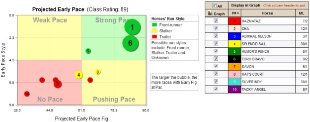
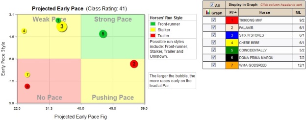
Projected Early Pace Graph
The labels in each quadrant are a general form to use to interpret the BubbleCapper data. Horses in the green zone are projected to be on or near the lead in the early going, while horses in the red zone are expected to be at the back of the pack in the early stages of the race. Horses in the Weak Pace yellow zone are typically early speed types that may not have strong enough pace figures to keep up with today’s field. Horses in the yellow Pushing Pace zone should be stalking the leaders.
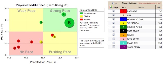
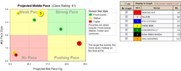
Projected Middle Pace Graph
The labels in each quadrant are a general form to use to interpret the BubbleCapper data. Horses in the green zone are projected to be on or near the lead in the middle part of the race, while horses in the red zone are expected to be at the back of the pack in the middle stages of the race. Horses in the Weak Pace yellow zone are typically early speed types that may not have strong enough pace figures to keep up with today’s field. Horses in the yellow Pushing Pace zone should be within striking distance of the leaders as the real running begins.
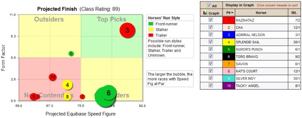
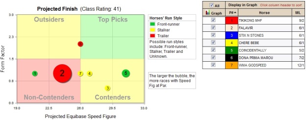
Projected Finish Graph
The labels in each quadrant are a general form to use to interpret the BubbleCapper data. Horses in the green zone are Top Picks since they show a competitive Projected Equibase Speed Figure and are in top condition compared to the rest of the field. Contenders are especially tough if their Projected Equibase Speed Figure is higher than the rest of the competition. Outsiders are in top form, but may not be strong enough to win. Make sure to get a price if backing an Outsider. Non-contenders should usually be avoided. In general, the larger the bubble, the more confidence one can put in a Top Pick, but those types do tend to be favorites.
Quarter Horses (and other breed types with races in yards)
Projected Start Graph
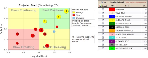
The labels in each quadrant are a general form to use to interpret the BubbleCapper data. Horses in the green zone are projected to be quickly in front as the gate opens, while horses in the red zone are expected to be at the rear shortly after the break. Horses in the Even Positioning yellow zone are typically average to slow breaking types that don’t break out of the gate as quickly as some others. Horses in the yellow Quick Breaking zone get away from the gate well, but may not be right out front in the early stages.
Projected Mid Race Graph
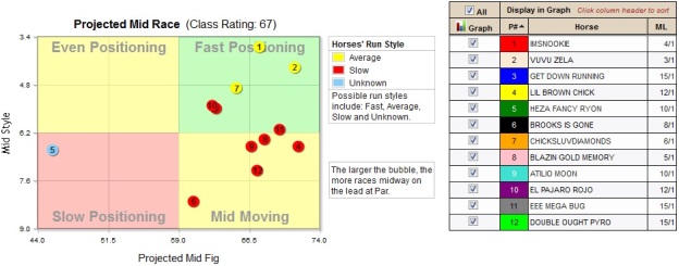
The labels in each quadrant are a general form to use to interpret the BubbleCapper data. Horses in the green zone are projected to be well into the race at the midpoint, while horses in the red zone will still be near the back. Horses in the Even Positioning yellow zone are expected to be midpack at the midpoint. Horses in the yellow Mid Moving zone should be in contention at the midpoint.
Projected Finish Graph
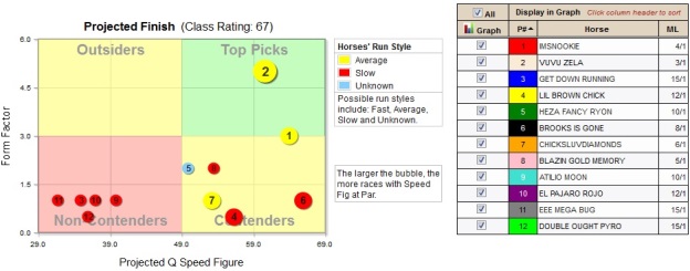
The labels in each quadrant are a general form to use to interpret the BubbleCapper data. Horses in the green zone are Top Picks since they show a competitive Projected Q Speed Figure and are in top condition compared to the rest of the field. Contenders are especially tough if their Projected Q Speed Figure is higher than the rest of the competition. Outsiders are in top form, but may not be fast enough to win. Make sure to get a price if backing an Outsider. Non-contenders should usually be avoided. In general, the larger the bubble, the more confidence one can put in a Top Pick, but those types do tend to be favorites.
BubbleCapper (Comprehensive Overview)
The BubbleCapper is a graphical representation of the pace scenario at different stages of the race. It is a powerful weapon to use to determine how a race may play out and contains crucial information to help you quickly make wagering decisions regarding a race. It is comprised of three different graphs that represent the projected positioning of each horse in the early, middle and final stages of a race. Four different components of each horse are represented by a bubble displayed in each graph: the value on the y-axis, the value on the x-axis, the size of the bubble and the color of the bubble (bubble color is the same on all three graphs).
Notes: In the BubbleCapper, a mouse hover on a bubble will display the data for the horse. A thoroughbred may have a more detailed Run Style designation of Alternator attached to the general running style, signifying a horse that switches between running styles. A quarter horse may have a Trouble-prone designation attached to Run Style to denote a horse that gets into trouble in a high percentage of races. Sometimes a bubble will be placed directly on the y-axis. This indicates that the value for the x-axis of this bubble is even lower than the lowest x value shown. Displaying the bubble in this fashion keeps the relative positioning of the other bubbles in a relationship that is similar to a typical graph.
A mouse hover on a program number will display the post position. A mouse hover on a horse name will display the trainer and jockey along with a link to easily add a horse note. (On a touch screen device, the mouse hover for these items can be accessed with a tap.)
For Thoroughbred Races
Projected Early Pace Graph
In this graph, the Early Pace Style is represented on the y-axis, the lower the value, the more likely the horse will race at the front of the pack at the first call. Projected Early Pace Fig is represented on the x-axis, the higher the value, the more likely the horse will be positioned at the front of the pack at the first call, or will be able to maintain a comfortable rate of speed in relationship to the leaders. The bubble color represents the general running style of the horse, green for a Front-runner (a horse that runs on or near the lead in the early stages of a race), yellow for a Stalker (a horse that lays a few lengths off of the lead in the early stages of the race), red for a Trailer (a horse that runs in the back of the pack in the early stages of the race) and blue for an Unknown running style. The size of the bubble represents how many races out of the last twelve that a horse ran a pace figure which is as fast or faster than the early pace figure expected for a race with today’s class rating (Races With Early Fig at Par).

The labels in each quadrant are a general form to use to interpret the BubbleCapper data. Horses in the green zone are projected to be on or near the lead in the early going, while horses in the red zone are expected to be at the back of the pack in the early stages of the race. Horses in the Weak Pace yellow zone are typically early speed types that may not have strong enough pace figures to keep up with today’s field. Horses in the yellow Pushing Pace zone can be especially tough if they are Stalkers or Trailers that end up with a strong Projected Equibase Speed Figure in the Projected Finish graph and there are multiple Front-runners in the race. Be on the lookout for a lone Front-runner that may get an easy lead. Horses with larger sized bubbles show consistency and should be able to handle the early pace pressure.
Projected Middle Pace Graph
In this graph, the Mid Pace Style is represented on the y-axis, the lower the value, the more likely the horse will race at the front of the pack at the second call. Projected Mid Pace Fig is represented on the x-axis, the higher the value, the more likely the horse will be positioned at the front of the pack at the second call, or will be able to maintain a comfortable rate of speed in relationship to the leaders. The bubble color represents the general running style of the horse, green for a Front-runner (a horse that runs on or near the lead in the early stages of a race), yellow for a Stalker (a horse that lays a few lengths off of the lead in the early stages of the race), red for a Trailer (a horse that runs in the back of the pack in the early stages of the race) and blue for an Unknown running style. The size of the bubble represents how many races out of the last twelve that a horse ran a pace figure which is as fast or faster than the mid pace figure expected for a race with today’s class rating (Races With Mid Fig at Par).

The labels in each quadrant are a general form to use to interpret the BubbleCapper data. Horses in the green zone are projected to be on or near the lead in the middle part of the race, while horses in the red zone are expected to be at the back of the pack in the middle stages of the race. Horses in the Weak Pace yellow zone are typically early speed types that may not have strong enough pace figures to keep up with today’s field. Horses in the yellow Pushing Pace zone can be especially tough if they are Stalkers or Trailers that end up with a strong Projected Equibase Speed Figure in the Projected Finish graph and there are multiple Front-runners in the race. See if a lone Front-runner from the Projected Early Pace graph may maintain his pace advantage. Horses with larger sized bubbles show consistency and should be able to handle the pace as the real running begins. Check to see if any Stalker or Trailers that were behind in the Projected Early Pace graph are projected to start making a move toward the earlier Strong Pace types.
Projected Finish Graph
In this graph, the Form Factor is represented on the y-axis, the higher the value, the more positive aspects of condition the horse has displayed. Projected Equibase Speed Figure is represented on the x-axis, the higher the value, the more likely the horse’s chance of winning. The bubble color represents the general running style of the horse, green for a Front-runner (a horse that runs on or near the lead in the early stages of a race), yellow for a Stalker (a horse that lays a few lengths off of the lead in the early stages of the race), red for a Trailer (a horse that runs in the back of the pack in the early stages of the race) and blue for an Unknown running style. The size of the bubble represents how many races out of the last twelve that a horse earned an Equibase Speed Figure not less than two points below today’s class rating (Races with E At Par).

The labels in each quadrant are a general form to use to interpret the BubbleCapper data. Horses in the green zone are Top Picks since they show a competitive Projected Equibase Speed Figure and are in top condition compared to the rest of the field. Contenders are especially tough if their Projected Equibase Speed Figure is higher than the rest of the competition. Outsiders are in top form, but may not be strong enough to win. Make sure to get a price if backing an Outsider, and check the Signals page for positive signs, especially for the Profile signals of Longshot or Bomber. Non-contenders should usually be avoided. The one exception is a Lone Front-runner that projected to control the lead in the previous two graphs and has one or more of the Signals of Longshot, Bomber, Good Workout, or Equipment Change. In general, the larger the bubble, the more confidence one can put in a Top Pick, but those types do tend to be favorites.
For Races in Yards
Projected Start Graph
In this graph, the Early Style is represented on the y-axis, the lower the value, the more likely the horse will race near the lead shortly after the break. Projected Break is represented on the x-axis, the lower the value, the more likely the horse will break well from the gate. The bubble color represents the general running style of the horse, green for a Fast horse (breaks from the gate quickly), yellow for an Average horse (breaks from the gate normally), red for a Slow horse (breaks from the gate slowly) and blue for an Unknown running style. The size of the bubble represents the Non-trouble Factor, the smaller the bubble, the more prone the horse is into getting into trouble, either because of lack of experience or because the horse has shown a propensity to get into trouble in most races.

The labels in each quadrant are a general form to use to interpret the BubbleCapper data. Horses in the green zone are projected to be quickly in front as the gate opens, while horses in the red zone are expected to be at the rear shortly after the break. Horses in the Even Positioning yellow zone are typically average to slow breaking types that don’t break out of the gate as quickly as some others. Horses in the yellow Quick Breaking zone get away from the gate well, but may not be right out front in the early stages. Horses with larger sized bubbles have the ability to stay away from trouble during the race. If there are lots of horses with small bubbles, beware of a chaotic start with lots of bumping and gate troubles.
Projected Mid Race Graph
In this graph, the Mid Style is represented on the y-axis, the lower the value, the more likely the horse will be near the lead at the midway point of the race. Projected Mid Fig is represented on the x-axis, the higher the value, the more likely the horse will be on or moving toward the lead at the midway point of the race. The bubble color represents the general running style of the horse, green for a Fast horse (breaks from the gate quickly), yellow for an Average horse (breaks from the gate normally), red for a Slow horse (breaks from the gate slowly) and blue for an Unknown running style. The size of the bubble represents the Midpoint Factor, the larger the bubble, the more often the horse has been on or near the lead at the midway point of races with today’s class rating or higher.

The labels in each quadrant are a general form to use to interpret the BubbleCapper data. Horses in the green zone are projected to be well into the race at the midpoint, while horses in the red zone will still be near the back. Horses in the Even Positioning yellow zone are expected to be midpack at the midpoint. Horses in the yellow Mid Moving zone should be in contention, pay attention to any Slow horses that have moved into this zone from the previous Slow Breaking zone. Check if a horse or horses that were in the Fast Positioning zone have maintained an advantage of being projected to remain in front. Horses with larger sized bubbles show consistency to be on or near the lead at the midpoint.
Projected Finish Graph
In this graph, the Form Factor is represented on the y-axis, the higher the value, the more positive aspects of condition the horse has displayed. Projected Q Speed Figure is represented on the x-axis, the higher the value, the more likely the horse’s chance of winning. The bubble color represents the general running style of the horse, green for a Fast horse (breaks from the gate quickly), yellow for an Average horse (breaks from the gate normally), red for a Slow horse (breaks from the gate slowly) and blue for an Unknown running style. The size of the bubble represents how many races out of the last twelve that a horse earned a Q Speed Figure not less than two points below today’s class rating (Races with Q At Par).

The labels in each quadrant are a general form to use to interpret the BubbleCapper data. Horses in the green zone are Top Picks since they show a competitive Projected Q Speed Figure and are in top condition compared to the rest of the field. Contenders are especially tough if their Projected Q Speed Figure is higher than the rest of the competition. Outsiders are in top form, but may not be fast enough to win. Make sure to get a price if backing an Outsider, and check the Signals page for positive signs, especially for the Profile signals of Longshot or Bomber. Non-contenders should usually be avoided. In general, the larger the bubble, the more confidence one can put in a Top Pick, but those types do tend to be favorites.
For Races in Furlongs (Non-thoroughbreds)
Projected Early Pace Graph
In this graph, the Early Pace Style is represented on the y-axis, the lower the value, the more likely the horse will race at the front of the pack at the first call. Projected Early Pace Fig is represented on the x-axis, the higher the value, the more likely the horse will be positioned at the front of the pack at the first call, or will be able to maintain a comfortable rate of speed in relationship to the leaders. The bubble color represents the general running style of the horse, green for a Front-runner (a horse that runs on or near the lead in the early stages of a race), yellow for a Stalker (a horse that lays a few lengths off of the lead in the early stages of the race), red for a Trailer (a horse that runs in the back of the pack in the early stages of the race) and blue for an Unknown running style. The size of the bubble represents how many races out of the last twelve that a horse has been on the lead in the early part of a race that had a class rating not less than two points below today’s class rating (Races With Early Fig at Par).
The labels in each quadrant are a general form to use to interpret the BubbleCapper data. Horses in the green zone are projected to be on or near the lead in the early going, while horses in the red zone are expected to be at the back of the pack in the early stages of the race. Horses in the Weak Pace yellow zone are typically early speed types that may not have strong enough pace figures to keep up with today’s field. Horses in the yellow Pushing Pace zone can be especially tough if they are Stalkers or Trailers that end up with a strong Projected Equibase Speed Figure in the Projected Finish graph and there are multiple Front-runners in the race. Be on the lookout for a lone Front-runner that may get an easy lead. Horses with larger sized bubbles show consistency and should be able to handle the early pace pressure.
Projected Middle Pace Graph
In this graph, the Mid Pace Style is represented on the y-axis, the lower the value, the more likely the horse will race at the front of the pack at the second call. Projected Mid Pace Fig is represented on the x-axis, the higher the value, the more likely the horse will be positioned at the front of the pack at the second call, or will be able to maintain a comfortable rate of speed in relationship to the leaders. The bubble color represents the general running style of the horse, green for a Front-runner (a horse that runs on or near the lead in the early stages of a race), yellow for a Stalker (a horse that lays a few lengths off of the lead in the early stages of the race), red for a Trailer (a horse that runs in the back of the pack in the early stages of the race) and blue for an Unknown running style. The size of the bubble represents how many races out of the last twelve that a horse has been on the lead in the middle part of a race that had a class rating not less than two points below today’s class rating (Races With Early Fig at Par).
The labels in each quadrant are a general form to use to interpret the BubbleCapper data. Horses in the green zone are projected to be on or near the lead in the middle part of the race, while horses in the red zone are expected to be at the back of the pack in the middle stages of the race. Horses in the Weak Pace yellow zone are typically early speed types that may not have strong enough pace figures to keep up with today’s field. Horses in the yellow Pushing Pace zone can be especially tough if they are Stalkers or Trailers that end up with a strong Projected Equibase Speed Figure in the Projected Finish graph and there are multiple Front-runners in the race. See if a lone Front-runner from the Projected Early Pace graph may maintain his pace advantage. Horses with larger sized bubbles show consistency and should be able to handle the pace as the real running begins. Check to see if any Stalker or Trailers that were behind in the Projected Early Pace graph are projected to start making a move toward the earlier Strong Pace types.
Projected Finish Graph
In this graph, the Form Factor is represented on the y-axis, the higher the value, the more positive aspects of condition the horse has displayed. Projected Equibase Speed Figure is represented on the x-axis, the higher the value, the more likely the horse’s chance of winning. The bubble color represents the general running style of the horse, green for a Front-runner (a horse that runs on or near the lead in the early stages of a race), yellow for a Stalker (a horse that lays a few lengths off of the lead in the early stages of the race), red for a Trailer (a horse that runs in the back of the pack in the early stages of the race) and blue for an Unknown running style. The size of the bubble represents how many races out of the last twelve that a horse earned an Equibase Speed Figure not less than two points below today’s class rating (Races with E At Par).
The labels in each quadrant are a general form to use to interpret the BubbleCapper data. Horses in the green zone are Top Picks since they show a competitive Projected Equibase Speed Figure and are in top condition compared to the rest of the field. Contenders are especially tough if their Projected Equibase Speed Figure is higher than the rest of the competition. Outsiders are in top form, but may not be strong enough to win. Make sure to get a price if backing an Outsider, and check the Signals page for positive signs, especially for the Profile signals of Longshot or Bomber. Non-contenders should usually be avoided. The one exception is a Lone Front-runner that projected to control the lead in the previous two graphs and has one or more of the Signals of Longshot, Bomber, Good Workout, or Equipment Change. In general, the larger the bubble, the more confidence one can put in a Top Pick, but those types do tend to be favorites.
Signals
The Signals grid displays icons representing relevant information about each horse for today’s race. Green signals are positive aspects, yellow signals highlight notable information, and red signals are warning sings. The Signals Grid is a very useful tool to quickly view “angles” regarding each entrant. Note: Users can change icons to check marks through settings.
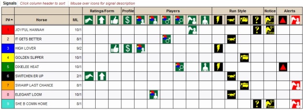
Positive Signals (Green):
Ratings/Form – Positive aspects regarding a horse’s ratings or conditioning:
- Top BubbleCapper Horse – Horse has the highest Projected Equibase Speed Figure in the BubbleCapper. (Highest Projected Q Speed Figure if distance is in yards.) The predicted top finish by the BubbleCapper is a strong positive sign.
- Positive Form – Horse appears to be in positive condition. Horse has a Form Factor greater than or equal to 3.0 in the BubbleCapper. Especially positive if not many in the race have this designation.
- Four Star – Horse is rated on top for Power, Speed, Class and Pace ratings. A rare combination of positive aspects.
- Top Power – Horse has the highest TrackMaster Power Rating. Always a horse not to overlook.
- Good Workout – Horse has a recent five furlong bullet workout. A strong five furlong workout has been shown to be a sign of positive conditioning.
Profiles – A set of characteristics reflecting a positive profile of a horse:
- Lone Front-runner – Horse is the only Front-runner in the race. (Horse is the only Fast breaking horse in the race if race is in yards.) A horse that may get an easy lead is always dangerous as a possibility to lead from gate to wire.
- Blue Chip – Betting on this horse produces consistent profits. A sign of a top, tough, consistent animal.
- Partner – Trainer and Horse, or Jockey and Horse, have a strong relationship.
- Bomber – Horse shows a good return on investment by winning at a price in the past. Don’t overlook these types if they are in top form or have a top Projected Equibase Speed Figure and are going off at long odds.
- Longshot – Horse has positive longshot angles.
- Horse For Course – Horse has had success at today’s track on today’s surface. Horse feels right at home in today’s race.
Players – Positive aspects regarding a horse’s trainer, jockey, sire or dam:
- Top Trainer – Trainer has the highest percentage in the Player Graphs.
- Top Jockey – Jockey has the highest percentage in the Player Graphs.
- Top Sire – Sire has the highest percentage in the Player Graphs.
- Top Dam – Dam has the highest percentage in the Player Graphs.
- Positive Trainer – Trainer has a high winning percentage at today’s distance/surface. Always a plus for today’s race.
- Positive Jockey – Jockey has a high winning percentage at today’s distance/surface. Always a plus for today’s race.
- Pawn – Trainer and Jockey are a strong combination. A hot trainer/jockey combination can sometime wake up any type of horse.
- Grass Pedigree – Horse is first or second time trying the turf, and sire’s offspring have had success on the turf.
Notification Signals (Yellow):
Run Style – Labels a horse’s typical running style:
- Front-runner – Horse is expected to be on or near the lead in the early stages of the race. (If race is in yards, Fast – Horse is expected to break from the gate quickly.)
- Stalker – Horse is expected to be a few lengths off of the lead in the early stages of the race. (If race is in yards, Average: Horse is expected to break normally from the gate.)
- Trailer – Horse is expected to be at the back of the pack in the early stages of the race. (If race is in yards, Slow: Horse is expected to break from the gate slowly.)
- Unknown – Horse’s running style is unknown. Horse is a first time starter, a foreign horse making his first start in North America, or a horse that hasn’t raced in a very long time.
Notices – Highlights an unusual aspect regarding a horse:
- Troubled Last Race – Horse had trouble in his last race is not usually trouble-prone. Horse doesn’t normally get into trouble and had an excuse last time out. Look for signs of improvement.
- First Time Starter – Horse is making first lifetime start.
- Foreign Horse – Horse has raced mainly outside of North America most recently.
- Equipment Change – Horse is putting on blinkers today or taking off blinkers today. Many times an equipment change can be a tipoff to improved performance.
- Long Layoff – Horse hasn’t raced in over 60 days. Need to be a little bit cautious with horses coming off such a long layoff.
Warning Signals (Red):
Alerts – A warning sign regarding the horse, trainer or jockey:
- Poor Form – Horse does not appear to be in top condition. Horse has a Form Factor less than 1.0 in the BubbleCapper.
- Trouble-prone Horse – Horse has had trouble in many races.
- Bridesmaid – Horse likes to finish second and third. Many times these types of horse look best on paper, but run second or third habitually.
- Low Win Percent Trainer – Trainer has a low winning percentage at today’s distance/surface.
- Low Win Percent Jockey – Jockey has a low winning percentage at today’s distance/surface.
Notes: A mouse hover on a program number will display the post position. A mouse hover on a horse name will display the trainer and jockey along with a link to easily add a horse note. (On a touch screen device, the mouse hover for these items can be accessed with a tap.)
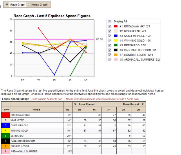
Speed/Class Graphs
Speed/Class Graphs allow you to view the latest Equibase Speed Figures (Q Speed Figures for races in yards) and Class Ratings for an individual horse, or to view the horses’ last five Equibase Speed Figures (Q Speed Figures for races in yards) together on a single graph.
Click on Race Graph or Horse Graph to choose a graph type.
For the Race Graph, clicking on the Display All check box will display the graph lines representing the Equibase Speed Figures (Q Speed Figures for races in yards) for the last five races of every horse in the race. The straight fuschia line represents the Class Rating of today’s race. Clicking on a check box next to a horse's name will select or deselect the horse's graph.
To choose a Horse Graph, click on the radio button in the legend of the horse you wish to view. The green line represents the horse’s Equibase Speed Figures (Q Speed Figures if the race is in yards.) for his most recent races. The blue line represents the Class Ratings of a horse’s most recent races. The straight fuchsia line represents the Class Rating of today’s race.
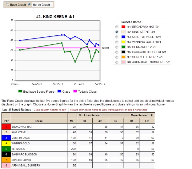
Notes: In the grid, a mouse hover on a program number will display the post position. A mouse hover on a horse name will display the trainer and jockey along with a link to easily add a horse note. (On a touch screen device, the mouse hover for these items can be accessed with a tap.)
Player Graphs
View a bar graph or pie chart of the cumulative stats for this race by Trainer, Jockey, Sire or Dam. A proprietary algorithm is used to analyze relevant player (trainer, jockey, sire, or dam) statistics for today’s race, to compare players against one another. The algorithm takes into account win percentages, return on investment, and sample size to determine the calculated percentages. Percentages are based on relevant statistics for today’s start, such as distance/surface, distance change, trainer/jockey combo, etc.
Click on the button of the Player (Trainer, Jockey, Sire or Dam) you wish to view to display the corresponding graph. Click on Pie Chart or Bar Graph to choose the data view.
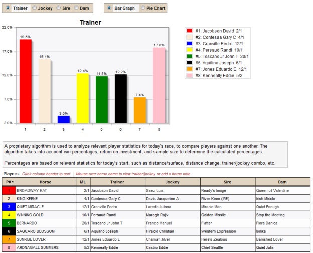
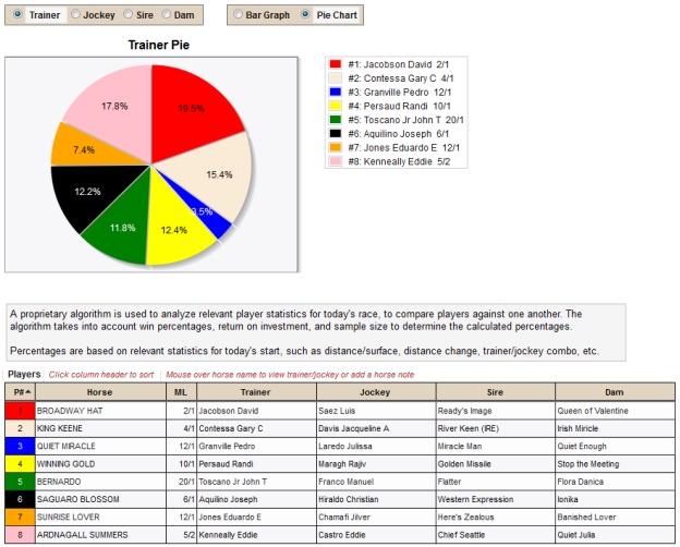
Notes: In the grid, a mouse hover on a program number will display the post position. A mouse hover on a horse name will display the trainer and jockey along with a link to easily add a horse note. (On a touch screen device, the mouse hover for these items can be accessed with a tap.)
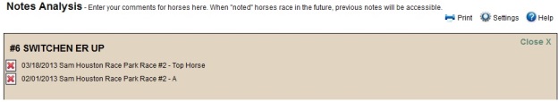
Notes
Enter your comments for horses in the Notes section. When "noted" horses race in the future, previous notes will be accessible. Notes are saved through your TrackMaster account. You may have up to ten saved notes for each horse.
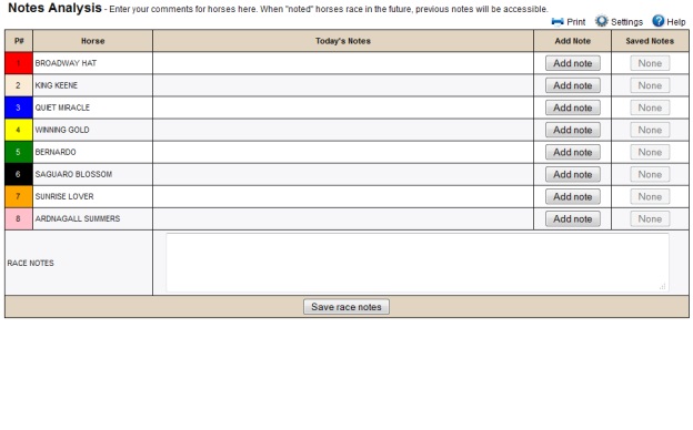
Click Add note for a horse and enter any comments in the dialog box, then click on Save note. Type any comments for the race in the Race Notes section at the bottom of the page and click on Save race notes. Once notes have been entered, click on the View notes button to see notes for an individual horse. The View notes button will also display any notes you may have entered for previous race cards. Click on the red x when viewing notes to delete a note.
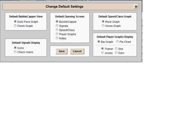
Settings
Set your EquiGraphix default settings for the launch of various displays. For the Initial Category Display when opening a race, the options can be set for BubbleCapper, Signals, Speed/Class Graphs, Player Pie or Notes. (The default is the BubbleCapper.) For the Default BubbleCapper View, the options are Early Pace Graph or Finish Graph (Early Pace Graph is the default.) For the Initial Player Graphs Display, the player options are Trainer, Jockey, Sire or Dam, and the data view options are Pie Chart or Bar Graphs. (The defaults are Trainer and Bar Graph.) For the Initial Speed/Class Graphs Display, the options are Race Graph or Horse Graph. (The default is Race Graph.) The Default Signals Display can be set to Icons or Check marks. (The default is Icons.)
After any settings changes are made, that will be the Initial Display for each of the different views.